关于display:flex布局,有人了解颇深,我也是看着别人的东西学习的。
display:flex的布局是什么、基本概念之类的我根本就不了解,只会用。每次看到概念之类的东西,我都是扫一眼就过去。
第一个属性和用法:flex-direction
我了解的方法有4个:row(水平排列)、row-revese(水平反向排列)、column(垂直排列)、column-reserve(垂直反向排列)
<!DOCTYPE html>
<html>
<head>
<meta charset="UTF-8">
<title></title>
</head>
<body>
<div style="width:300px;border:1px solid red;display: flex;flex-direction: row;">
<div style="width: 100px;height: 100px;background-color: black;"></div>
<div style="width: 100px;height: 100px;background-color: green;"></div>
<div style="width: 100px;height: 100px;background-color: yellow;"></div>
<div style="width: 100px;height: 100px;background-color: blue;"></div>
</div>
</body>
</html>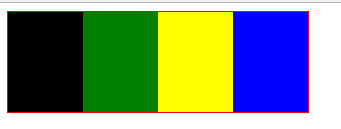
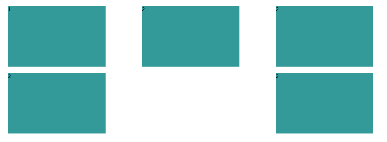
上面的代码和效果图是属性为row时的效果
注意:虽然是设置好的宽度,但是父容器只有300px,子div没法达到100px,而是适应父容器
只需要将 flex-direction: row代码替换成flex-direction:row-revese 或者flex-direction:column 或则flex-direction:column-reserve,就可以得到不同的效果
下面是效果图:

row-revese
——-

column
——-

column-reverse
——-
第二个属性和用法:flex-wrap
这是换行属性:nowrap(不换行)、wrap(换行)、wrap-reverse(方向换行)
<!DOCTYPE html>
<html>
<head>
<meta charset="UTF-8">
<title></title>
</head>
<body>
<div style="width:300px;border:1px solid red;display: flex;flex-wrap: wrap;">
<div style="width: 100px;height: 100px;background-color: black;"></div>
<div style="width: 100px;height: 100px;background-color: green;"></div>
<div style="width: 100px;height: 100px;background-color: yellow;"></div>
<div style="width: 100px;height: 100px;background-color: blue;"></div>
</div>
</body>
</html>
新闻热点


疑难解答