首页| 新闻| 科技| 人物| 科学| 话题| 运营| 设计| 开发| 服务器| 学院| 产品| 网文| 娱乐| 游戏| 图片
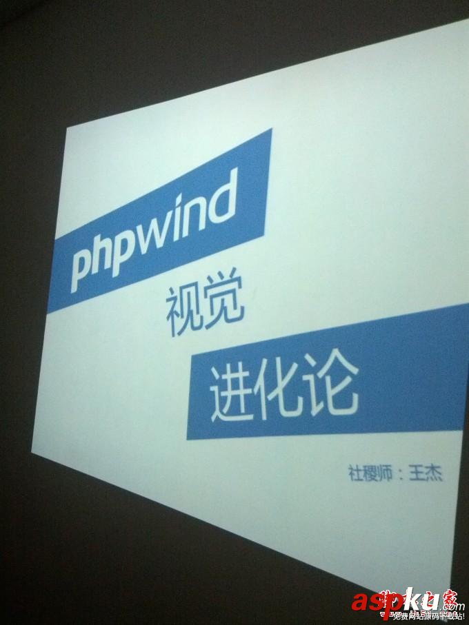
phpwind9.0系统的视觉进化论(
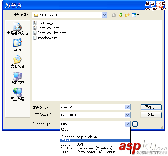
phpwind 的编码错误导致cookie
phpwind的rewrite重写原理
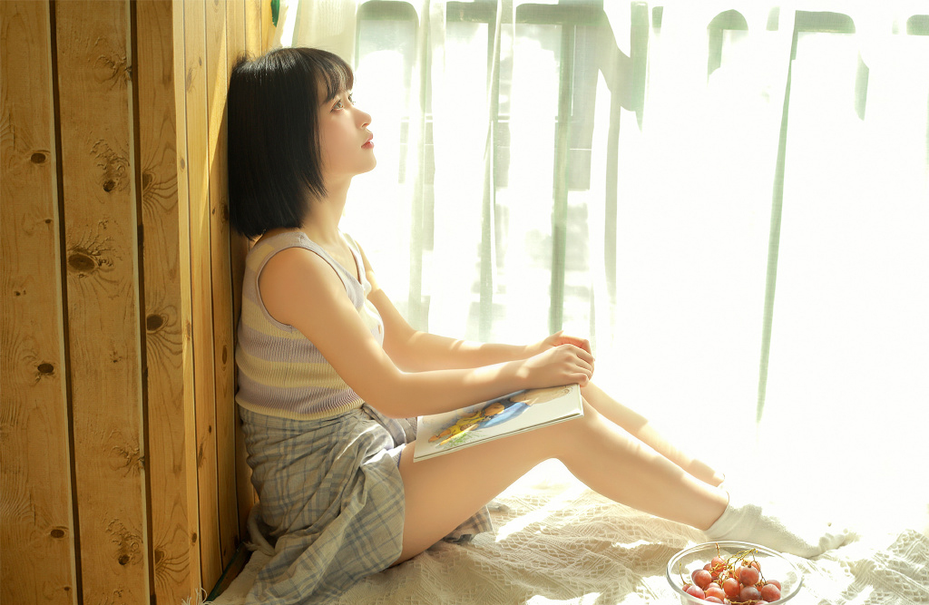
南国有佳人,容华若桃李
怀念青春,憧憬着自己的美好未来
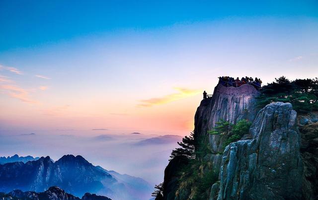
中国旅游景点集锦 美丽的风景
名胜古迹风景 最美的景色
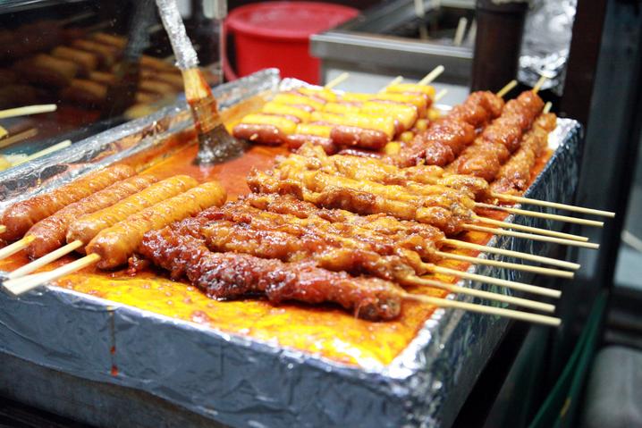
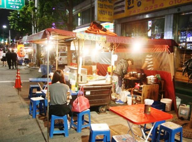
路边摊小吃 酒香不怕巷子深
特色路边摊小吃 下班路上的一道美食
爷爷都是从孙子走过来的
我太帅了,睡不着咋整啊
新闻热点
疑难解答
图片精选
DREAMWEAVER 技巧(下)
dreamweaver 3 表格经验谈
dreamweaver中网页折叠菜单的制作
Dreamweaver3 图层应用技巧(二)
网友关注