使用Matplotlib在wxPython的Panel上绘制曲线图,需要导入:
import numpyfrom matplotlib.backends.backend_wxagg import FigureCanvasWxAgg as FigureCanvasfrom matplotlib.figure import Figure
下面直接贴出源代码:
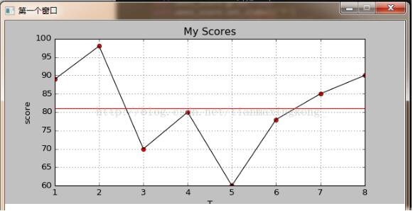
#coding=utf-8"""程序的主入口"""import wximport numpyfrom matplotlib.backends.backend_wxagg import FigureCanvasWxAgg as FigureCanvasfrom matplotlib.figure import Figureclass FirseFrame(wx.Frame): def __init__(self, parent=None, id=-1, title='', pos=wx.DefaultSize, size=wx.DefaultSize, style= wx.DEFAULT_FRAME_STYLE): wx.Frame.__init__(self, parent, id, title, pos, size, style) self.InitUI() pass def InitUI(self): self.SetBackgroundColour('white') self.scorePanel = wx.Panel(self) scores = [89, 98, 70, 80, 60, 78, 85, 90] sum = 0 for s in scores: sum += s average = sum / len(scores) t_score = numpy.arange(1, len(scores) + 1, 1) s_score = numpy.array(scores) self.figure_score = Figure() self.figure_score.set_figheight(3.6) self.figure_score.set_figwidth(7.8) self.axes_score = self.figure_score.add_subplot(111) self.axes_score.plot(t_score, s_score, 'ro', t_score, s_score, 'k') self.axes_score.axhline(y=average, color='r') self.axes_score.set_title(u'My Scores') self.axes_score.grid(True) self.axes_score.set_xlabel('T') self.axes_score.set_ylabel('score') FigureCanvas(self.scorePanel, -1, self.figure_score) passclass MainApp(wx.App): def OnInit(self): style = wx.DEFAULT_FRAME_STYLE^wx.MAXIMIZE_BOX self.frame = FirseFrame(id=-1, title=u'第一个窗口', pos=(10, 10), size=(340, 550), style=style) self.frame.Show() return Truedef main(): app = MainApp() app.MainLoop()if __name__ == "__main__": main()效果:
以上就是本文的全部内容,希望对大家的学习有所帮助,也希望大家多多支持错新网之家。
新闻热点


疑难解答