1 | <link rel="stylesheet" type="text/css" href="styleA.css" media="screen and (min-width: 400px)"> |
1 | <link rel="stylesheet" type="text/css" href="styleB.css" media="screen and (min-width: 600px) and (max-width: 800px)"> |
1 | @media screen and (max-width: 600px) { /*当屏幕尺寸小于600px时,应用下面的CSS样式*/ |
2 | .class { |
3 | background: #ccc; |
4 | } |
5 | } |
| media_type | 设备类型说明 |
| all | 所有设备 |
| aural | 听觉设备 |
| braille | 点字触觉设备 |
| handled | 便携设备,如手机、平板电脑 |
| | 打印预览图等 |
| projection | 投影设备 |
| screen | 显示器、笔记本、移动端等设备 |
| tty | 如打字机或终端等设备 |
| tv | 电视机等设备类型 |
| embossed | 盲文打印机 |
以下是demo
01 | <!DOCTYPE HTML> |
02 | <html> |
03 | <head> |
04 | <meta charset="utf-8"> |
05 | <meta name="viewport" content="width=device-width, initial-scale=1" /> |
06 | <title>css3-media-queries-demo</title> |
07 | <style> |
08 | body, div, dl, dt, dd, ul, ol, li, h1, h2, h3, h4, h5, h6, pre, form, fieldset, input, textarea, p, blockquote, th, td { |
09 | padding: 0; |
10 | margin: 0; |
11 | } |
12 | .content{ |
13 | zoom:1; |
14 | } |
15 | .content:after{ |
16 | content: "."; |
17 | display: block; |
18 | height: 0; |
19 | clear: both; |
20 | visibility: hidden; |
21 | } |
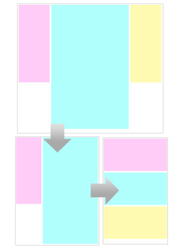
22 | .leftBox, .rightBox{ |
23 | float: left; |
24 | width: 20%; |
25 | height: 500px; |
26 | margin: 5px; |
27 | background: #ffccf7; |
28 | display: inline; |
29 | -webkit-transition: width 1s ease; |
30 | -moz-transition: width 1s ease; |
31 | -o-transition: width 1s ease; |
32 | -ms-transition: width 2s ease; |
33 | transition: width 1s ease; |
34 | } |
35 | .middleBox{ |
36 | float: left; |
37 | width: 50%; |
38 | height: 800px; |
39 | margin: 5px; |
40 | background: #b1fffc; |
41 | display: inline; |
42 | -webkit-transition: width 1s ease; |
43 | -moz-transition: width 1s ease; |
44 | -o-transition: width 1s ease; |
45 | -ms-transition: width 1s ease; |
46 | transition: width 1s ease; |
47 | } |
48 | .rightBox{ |
49 | background: #fffab1; |
50 | } |
51 | @media only screen and (min-width: 1024px){ |
52 | .content{ |
53 | width: 1000px; |
54 | margin: auto |
55 | } |
56 | } |
57 | @media only screen and (min-width: 400px) and (max-width: 1024px){ |
58 | .rightBox{ |
59 | width: 0; |
60 | } |
61 | .leftBox{ width: 30%} |
62 | .middleBox{ width: 65%} |
63 | } |
64 | @media only screen and (max-width: 400px){ |
65 | .leftBox, .rightBox, .middleBox{ |
66 | width: 98%; |
67 | height: 200px; |
68 | } |
69 | } |
70 | </style> |
71 | </head> |
72 |
73 | <body> |
74 | <div class="content"> |
75 | <div class="leftBox"></div> |
76 | <div class="middleBox"></div> |
77 | <div class="rightBox"></div> |
78 | </div> |
79 | </body> |
80 | </html> |
新闻热点


疑难解答