首页| 新闻| 科技| 人物| 科学| 话题| 运营| 设计| 开发| 服务器| 学院| 产品| 网文| 娱乐| 游戏| 图片
网站常见问题汇总
网站后台更新了为什么前台看不
校园甜美的背影,洋溢着青春烂漫的回忆
南国有佳人,容华若桃李
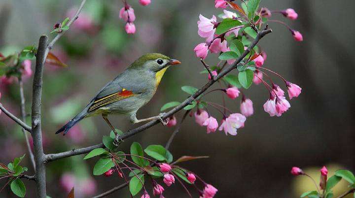
春天的魅力:绿杨烟外晓寒轻
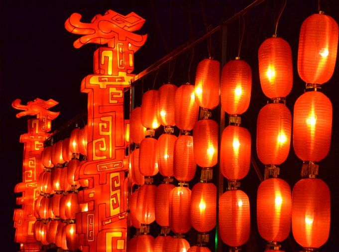
春节临近,各地春节彩灯高高挂
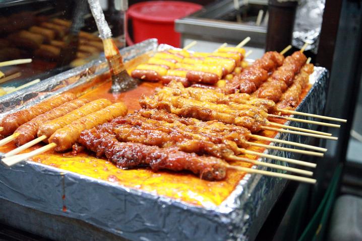
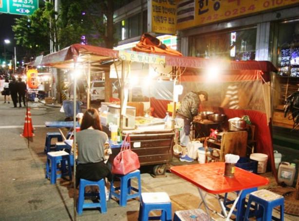
路边摊小吃 酒香不怕巷子深
特色路边摊小吃 下班路上的一道美食
爷爷都是从孙子走过来的
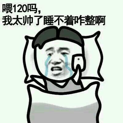
我太帅了,睡不着咋整啊
新闻热点
疑难解答
图片精选
网页教程:网站页面的制作流程是什么
网页设计排版的八个小技巧
什么是好的网页设计?网页设计原则及
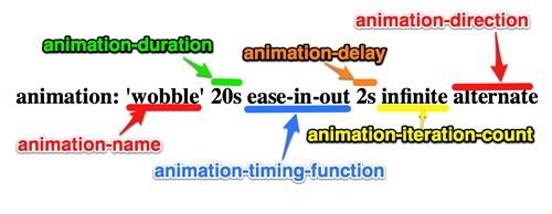
讲解CSS3中常用的Animation动画的
网友关注